
Home · Technology · Nov 2 archive
Google Redesigns Icons for Contacts, Messages, and Phone
· ConfirmedShare on
In Short: Google is rolling out redesigned icons for its Contacts, Messages, and Phone apps, following earlier updates to the Workspace and Pixel apps earlier this year.
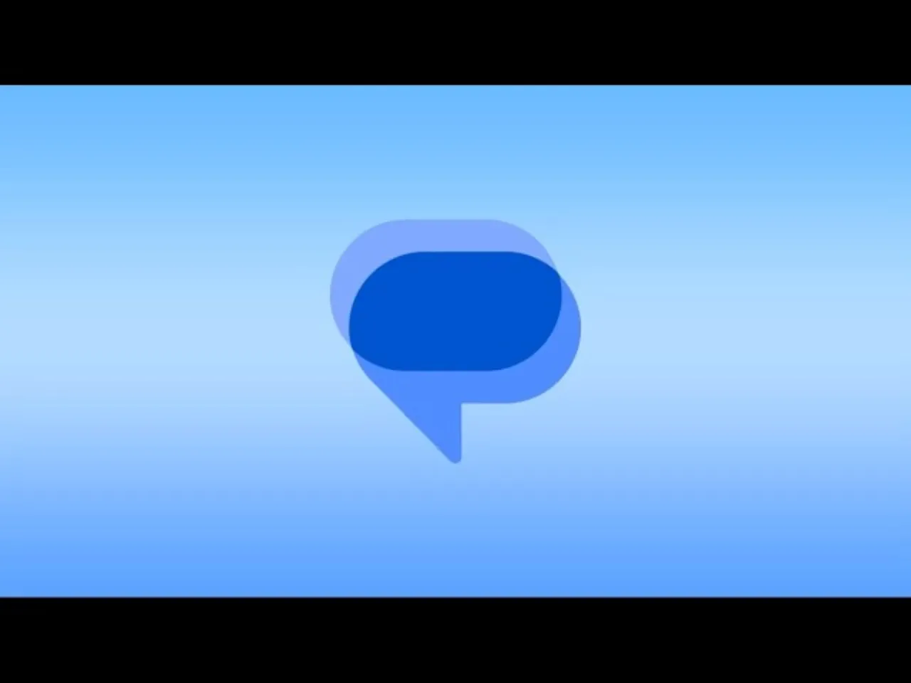
Google is rolling out redesigned icons for its Contacts, Messages, and Phone apps, following earlier updates to the Workspace and Pixel apps earlier this year. According to 9To5Google, the new icons are sharper and clearer on homescreens, with subtle gradients and easily readable edges, making them less visually cluttered than the previous designs.
The general shapes of the apps remain unchanged, but the redesign brings updated curvature and coloring to align with the rest of Google's apps. The new icons are rolling out over the coming weeks via the Play Store and are already live with the latest Google Messages beta.
According to Android Kenya, the redesign follows user feedback, with Google adjusting the curvature, spacing, and coloring to make the icons clearer on smartphone home screens. The new designs incorporate subtle gradients and more defined edges, following the visual direction Google has been adopting across its products, including its updated corporate logo.
Google Messages is receiving a particularly noticeable visual change, with its new icon adopting a more rounded messaging bubble, blue gradients, and sharper outlines. The new icons should also appear on contacts.google.com and messages.google.com/web.
The new icons are rolling out from November 2, 2026, with wider availability expected over the coming weeks. Google says the updated icons are rolling out to Android phones, although some users may not see them immediately.
The idea is to make these apps feel more consistent with Google's new design language, especially as more of its apps adopt the same gradient-heavy look. Google says the functionality of these apps isn’t changing as a result of the new icons.
According to SammyGuru, Google Messages is preparing to cut the pinned conversation limit from 20 to just six. Pinned conversations will appear with a large contact icon in two rows of three chats each, and new messages will not automatically shift to the top.
Google has also updated the coloring, spacing, and gradients so that the icon aligns perfectly with other Google icons throughout the ecosystem, as noted by Thurrott.com.
The new icons trade the flat blue look for a gradient style in line with the updates across Google’s other logos, as reported by The Verge.
In a separate post on Google Support about the new Google Messages icon, the company added that it has updated the coloring, spacing, and gradients so that the icon aligns perfectly with other Google icons throughout the ecosystem.
Google Phone and Google Contacts are receiving matching visual updates, bringing the three applications closer together as part of Google’s communication app family. The redesign moves away from the previous overlapping shapes, giving the application a cleaner appearance that is more consistent with Google’s current design language.
Background
Google is overhauling the icons for its Contacts, Messages, and Phone apps, following earlier redesigns of the Workspace and Pixel apps earlier this year.
What's confirmed
- Google says the “icons are sharper and clearer” on homescreens thanks to a “subtle but crisp gradient with easily readable edges.” These are less visually cluttered than the old ones with the intersecting lines and hints of layering.
- Don’t worry, the functionality of these apps isn’t changing as a result of the new icons.
- Google is rolling out redesigned icons for three of its Android applications: Google Messages, Phone by Google and Google Contacts.
- According to Google’s announcement, the redesign follows user feedback, with the company saying it has adjusted the curvature, spacing and colouring to make the icons clearer on smartphone home screens.
- Apple’s iMessage icon is green despite its familiar blue conversation bubbles, while Google Messages has a blue icon but displays green bubbles when communicating with iPhone users.
- Google Messages is receiving a particularly noticeable visual change, with its new icon adopting a more rounded messaging bubble, blue gradients and sharper outlines.
- Google says the updated icons are rolling out from November 2, 2026, with wider availability expected over the coming weeks.
- Last year, Google updated its iconic "G" logo with a new gradient look, which the company said represented its shift toward an AI-first era.
- Google says the new icons have already started rolling out to Android phones, although I haven't spotted them on my Pixel 11 Pro just yet.
- The company has not forgotten them, however, and it has just announced the rollout of new icons for three of its most essential core apps – Google Messages, Phone by Google, and Google Contacts.
- The company describes the new icons as being sleek, and the shared look creates a pleasing sense of cohesion.
- Android users get the redesign over several weeks with no feature changes, after 14 Workspace icons went gradient in May.
What's still developing
- The exact time frame for the roll out of these new icons is not entirely clear, but do not be surprised when the icons on your home screen change sometime soon.
- However, it turns out that the Messages app won’t be the only one getting a new look.
- After we gave you an early look at the new Google Messages icon, the tech giant has now made it official.
- BetaNews has reported on technology independently since 1998.